 Giulliana Murinelli
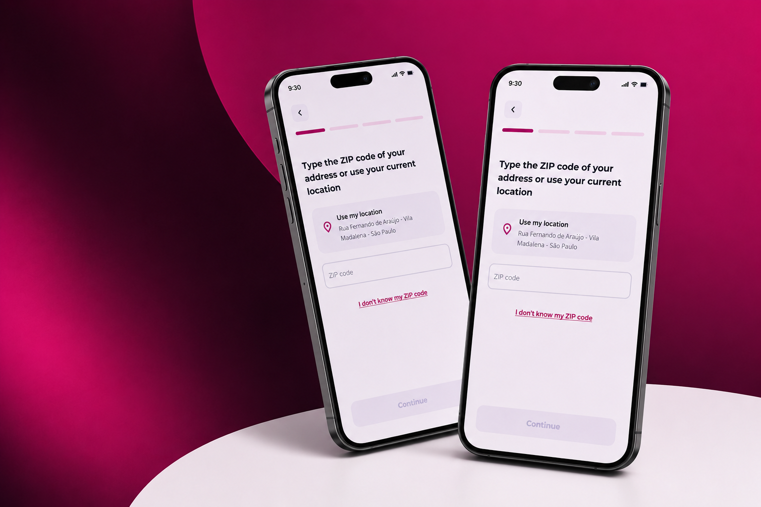
Overview
meutudo is a 100% digital fintech offering payroll-deductible loans (consignado), with a user base composed mostly of seniors aged 60+.
The Formalization squad owns the entire contracting journey — a 4-step flow: Address → Banking data → Documents → Biometrics.
This case focuses on the first and most critical step: the Address.
Challenge
The Address step had a 40.9% drop-off rate — the highest friction point in the formalization flow.
Users struggled with ZIP-code dependency, limited recovery paths, lack of progress visibility, and poor autonomy over address editing. Many seniors also felt insecure when transitioning from simulation into contract formalization.
The challenge was reducing abandonment while preserving backend validation requirements and maintaining data reliability for the business.
Research
The approached discovery from four angles: a heuristic evaluation of every formalization step, quantitative analysis through Tableau and GA4, conversations with customer support agents to surface the most frequent user pains, and a prioritization exercise grouping issues by effort vs. impact across tech, design, and business.
After mapping the most critical opportunities, I built new flows, validated them with the team, created high-fidelity prototypes, and ran moderated usability tests before bringing the insights to stakeholders.
users weren't told they were entering the formalization stage, had no view of the steps ahead, and couldn't edit their address once submitted. Everyone also needed to know their Zip code to move forward.
no "no number" option for homes without one, an active navbar that allowed drop-off at any moment, and no autonomy for users to fix their own address after a mistake.
components and font sizes varied across the journey, creating real navigation and comprehension issues for our core persona.
The solution
Based on the findings, I redesigned the Address step with three new ways to enter an address — giving users flexibility, autonomy, and control:
with user permission, we capture the address automatically (including the house number when available), removing friction entirely.
for users who don't know their Zip code, they enter street, state, and city, and we look up the postal code for them.
for users who know it, with internal validation and immediate feedback if invalid.
I also added a pre-formalization screen that clearly signals the transition from simulation to contracting, plus visible progress steps throughout the journey so users always know where they are.
Conclusions and impact at the company
By reducing drop-off at the Address step, more users stayed in the formalization flow — directly increasing the final signature rate. Results were tracked post-launch through Tableau and GA4 across the full conversion funnel.
This project reinforced how much information architecture and clarity matter in critical, high-friction flows — especially when designing for an audience that needs extra care, like seniors navigating financial products. Small, intentional decisions (a progress bar, a "no number" checkbox, a geolocation option) compounded into a meaningful business outcome.