 Giulliana Murinelli
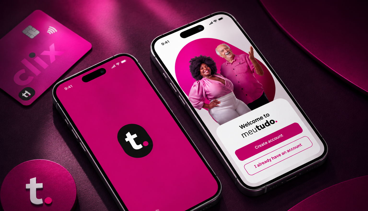
Overview
The consigned benefit card works similarly to a regular credit card, offered to INSS retirees and pensioners as a line of credit. Its main differentiator is that the minimum invoice amount is automatically deducted from the user's payroll. Clix was meutudo's credit platform, and its core feature allowed customers to withdraw up to 70% of their benefit card limit directly into their bank account.
Challenge
In 2023, after rolling out the benefit card to our users, we noticed two concerning patterns: a low activation rate despite the credit opportunity being available, and — among users who did activate the card — a very low conversion into the 70% withdrawal feature.
Our challenge was:
the benefit card despite the offer being clearly available.
and design a flow that would encourage the first withdrawal right after activation, increasing engagement with the product.
Usability testing with real users
We ran two complementary studies: a moderated test and an unmoderated test, paired with a quantitative survey.
Participants were split into two groups: customers who hadn't activated the benefit card despite having the offer available — to understand what was holding them back — and customers who had activated the card but hadn't withdrawn — to understand their perception of the product after onboarding.
Tools: Calendly (scheduling) · Maze (high-fidelity prototype testing) · Google Meet (moderated sessions)
of users do not understand that Clix is a credit platform by meutudo.
of users do not understand the affordance of the home screen component used to activate the product.
of users do not understand what the Benefit Card is.
By analyzing each screen, heatmaps, and key metrics (success rate, time on screen), we discovered something important: the main friction wasn't in the interface itself — it was in users' understanding of the product. People weren't sure what the benefit card *was*, how it worked, or what would happen after activation.
The solution
Based on the research findings, we redesigned the experience with four key changes:
for product activation on the home screen, making the opportunity unmissable.
about how the product works, addressing the comprehension gap directly.
on the home screen specifically guiding users toward their first withdrawal.
simplifying the mental model so users could focus on the product itself instead of an extra layer of naming.
Conclusions and impact at the company
This project reinforced something I now carry into every design decision: clear, effective communication about a product — from the very first touchpoint — is as important as the interface itself. By simplifying the UI and adding contextual information at the right moments, we lowered the comprehension barrier and meaningfully improved the user experience.
As a Product Designer, my biggest takeaway was that small, intentional changes in an interface can generate disproportionately large results in engagement and conversion.